Table of Contents
Congratulations! You managed to lead your target audience to visit your website and increase its traffic. Overcoming this challenge is great! But how exactly can you turn those visitors into leads or, better yet, customers?
Easy! The answer is by paying attention to your Call to actions. Something as simple as misplaced or poorly designed call to action button may lead to losing potential customers and prospects.That is why in this article we are going to discuss the importance of good call to action buttons on your website, and how to carefully design them and the best practices to achieve that.
What is the importance of CTA buttons?

The importance of CTA buttons lies in their psychology!
It is related to how our brains process information and make decisions.when customers visit a website, their brains are constantly processing information and making decisions about whether to take actions or not. And here comes the CTA buttons role, as they play a key role in guiding these decisions by providing clear and concise invitations to take action.
A fundamental psychological principle that enhances the impact of CTAs is commitment and consistency. By initiating a small commitment, like clicking on a CTA, individuals tend to follow through with larger commitments, such as filling out a form or completing a purchase. CTAs offer a straightforward and low-risk method for visitors to commit and progress in their customer journey.
Now that we have recognized the importance of CTA buttons and the psychology behind them, it’s about time to learn the best practices to create a good call to action on your website.
CTA buttons best practices!
1. Pay attention to CTA placement:
You need to draw your customers’ attention to your CTA buttons; that is why you need to carefully place them in strategic locations to make them prominent. One of the best places to put a CTA on your website is above the fold or near the top of a page, to increase its visibility and likelihood of being clicked. Studies indicate that placing CTAs above the fold can increase conversions by 317%. So try to follow the natural flow of your website page and bare in mind your customer’ reading nature pattern.
2. CTA colors are key!

Colors play a psychological role when it comes to consumer behavior and driving attention. That is why deciding on CTA button colors is crucial when designing your CTA. Try to make the colors appealing to your customers, but at the same time, make them consistent with your overall website design and colors. It was found that red CTAs boost Your Conversion rates by 21%.
However, it is not obligatory to use the red color if it doesn’t go with the overall design of your website page. Try to choose colors that are prominent and can draw attention, while at the same time, they won’t feel like they are forced into your website design. Use bright, contrasting, and bold colors like red, yellow, green, blue, orange, and purple. These will grab attention and encourage visitors to click, and will make your CTA stand out.
Make sure that you read our article: The Impact of Color Psychology on Website Design and Branding for a complete understanding of color psychology
3. Use action-oriented copy:
Utilize clear and direct language in your text to instruct visitors on the action you wish them to take, such as “Sign Up Now” or “Download Free Guide”. Research indicates that employing language that prompts action, such as “Get Started,” “Claim Your Free Trial,” or “Shop Now,” can boost conversion rates by as much as 121%. So, motivate your audience to proceed further by using engaging and vibrant language and by harnessing the power of action words.
4. Create a sense of urgency:

It’s effective to create a sense of urgency and scarcity when writing your CTA copy. As this can be a game changer for your conversion rate. Try to incorporate words like “Limited Time offer”, “Ending Soon”, and Only a Few Spots Left” to entice your website visitors to take instant action and increase your conversion rate. It was found that urgent CTAs can generate a 332% higher conversion rate.
5. Personalize your CTA:
According to different studies, it was found that using the first-person style in writing the CTAs is better than the second-person style. Studies reveal that using “I,” “Me,” or “My” in CTAs can result in a 90% higher conversion rate. So always try to use it, such as “get my free plan” instead of “get your free plan”.
Also, try to highlight your customers’ pain points or the benefits they need, and make your CTA copy relevant to them while avoiding making it generic and vague. As it was found that Customized CTAs Are Known to convert 42% More Visitors.
6. Get fancy with your CTA button design!
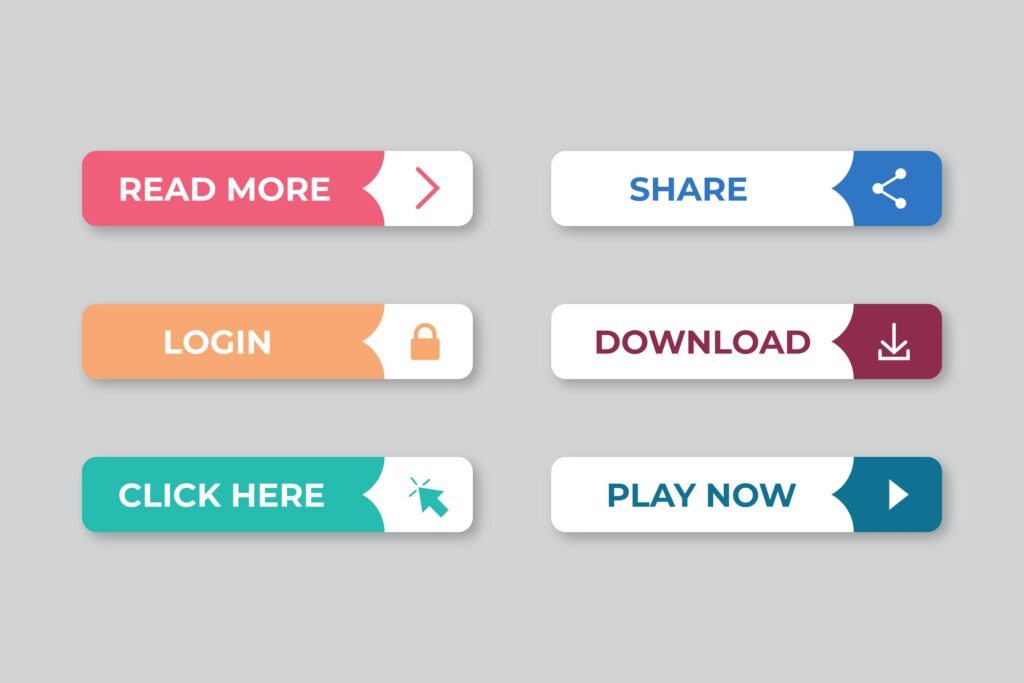
Shaping your CTA in a button is better than writing it in a text form; it was found that CTAs that are shaped like buttons saw a 45% increase in clicks. That’s why you need to care about how your CTA looks so that it can grab more attention and clicks. Another factor that can enhance your CTA design is displaying some elements around it that drive customers’ eye movement to it and entice them to click it, such as including arrows that point to your CTA button. This can lead to a 26% Increase in your conversion rate according to statistics.
So, crafting a visually appealing CTA button is essential as it can increase click-through rates by up to 42%
7. Add an extra text!
Sometimes, it is beneficial to display an Ezra line underneath your CTA button, if this line will contribute to adding more value. This is a typical approach used for free trial buttons. For instance, beneath the main text “Start Your Free Trial,” you might find additional details like “30-day trial, no credit card” in smaller text. Providing this valuable information prompts users to click and start their trial.
8. Social Proof strengthens your CTA:
Leveraging the power of social proof to supercharge your CTAs can work as magic for your conversion rate! Try to position one of your CTA buttons after providing social proof or testimonials. People are more likely to take action when they see others benefiting from your services, so showcase positive experiences to build trust and credibility. It was found that combining social proof with your CTAs can increase your conversion rate by 161%.
9. Include primary and secondary CTAs:
As visitors navigate through your website, they should encounter primary calls-to-action (CTAs) as well as secondary CTAs. These secondary CTAs serve various purposes, such as addressing a pain point, providing extra information, or inviting users to subscribe to an email list if they’re not ready to make a purchase yet. However, you need to strategically design these CTAs according to their importance and where you want to direct each buyer persona.
10. Constant A/B testing will never fail you:
A/B testing cannot be overlooked when it comes to your website. Studies demonstrate that companies implementing A/B testing on their CTAs experience a 49% surge in conversions. So, try out various versions of your CTAs, such as altering button color, position, or wording, to ascertain the most successful strategy for your audience. You can also use tools such as Crazy Egg or Hotjar to understand how visitors navigate your website and use that data to create higher-converting CTAs.
Wrap up:
Designing your CTAs is not a mere of luxury! It is essential to guarantee a high conversion rate, think of it as a directional cues that help your customer take the desired action and helps your business to achieve its goals. Never underestimate the CTA’s importance and always test for better results.


