


Table of Contents
It’s not surprising that user experience (UX) has emerged as a crucial component of Digital and performance marketing. Nowadays, Customers demand nothing less than the best experience from the goods and services they utilize. That is why the success of a marketing campaign is greatly influenced by the user experience (UX) of a website, app, or other digital platforms.
As we discussed in our previous article UX Marketing: Is it important?!, a good UX is responsible for customer satisfaction, higher conversion rate, revenues, and so many more benefits. While a bad UX can seriously harm a brand’s reputation, in addition to turning away potential customers.
Basically, websites with strong UX design are simple and easy to use, while those with poor UX design are not. In this article, you will get to learn the symptoms of a poor UX website, the negative impacts of having poor UX, and how to enhance it.
To evaluate your UX, we will help you know more about the signs that indicate to bad user experience so that you can enhance it.
Here are some of the Poor UX symptoms!
1. Slow-loading speed:
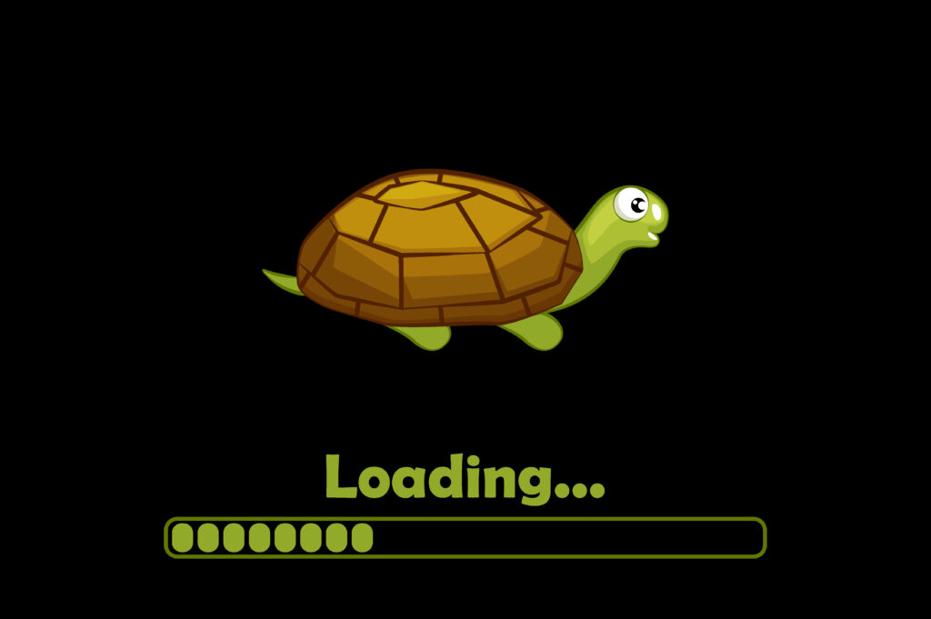
This happens when your website pages take a lot of time to load their content.
Unfortunately, slow-loading websites or applications cause frustration to consumers. When consumers wait a lot of time for a page to load, they become bored and will leave your website for good. Every year, companies lose $2.6 billion because of the slow loading of the website. According to Think with Google, From a 1 to 10-second page load time, the probability of a bounce increases 123%.
2. Too much data required:
If you are forcing your customers or visitors to provide too much data, then you need to know that this will do more harm than good! Annoying your customers with sign-up and newsletter forms to fill out will drive them away. For example, if you are an e-commerce website and you usually force your customers to fill out a sign-up form before they can check out, this will lead them to abandon their cart.
Also, if you are a business that has a website and your customers are encountered with so many pop-up windows to subscribe to a newsletter or sign up, then you are risking losing them. However, these are not the only scenarios for requiring too much data; if the customers are filling out a form and they find too much personal data required, they tend to leave the form, as it was found that 65% of website visitors would refuse to fill out a form if it asked for too much personal info.
3. Confusing Navigation:
Usually your customers come to your website to find specific information they want. But, what if they failed to find this information because of your poor and confusing navigation?
Your customers’ needs will be ungratified and they will end up leaving your website frustrated and might share their useless website experience with others! It was found that when 79% of users cannot find information on a website, they quickly leave it and look for the same information on other websites.
So if your website doesn’t facilitate the navigation process, and if the layout and design of your website’s navigation are unclear and difficult to use, then you need to think twice!
4. Not mobile-friendly:
If your website design doesn’t support a seamless experience across devices, then this is a great sign of having poor UX. It is very important now to have a website that can be displayed correctly and responsively across different devices, as it was found that 45% of users expect content to display correctly across different devices. While 67% of mobile users say they’d rather reward a mobile-friendly site by buying a product or service there than from one of its competitors, according to Think with Google.
5. Too focused on sales!
When users encounter a lot of pop-up ads and call to action, they get feelings of intrusiveness and irritation! So if your website is too sales focused and doesn’t provide the customers with valuable information other than your pop-up ads and your excessive buttons that entice them to take action, you should be expecting to have a lower conversion rate!
We know that putting call-to-action buttons is important for your business and UX. However, you need to balance it and play it smart.
6. Unappealing content and design:
Have a closer and more precise look at your website. Is there enough white space? Do your pages look neat and appealing? Do you get an aesthetic feeling when looking at it?
If your answer to one of those questions is no, or you can’t actually decide, then you have a poor UX! It was found that 40% of visitors leave an unorganized website, while 94% of first impressions of a brand’s website relate to its design.
Your website design should be attractive and organized; you need to combine both beautiful designs with the right amount of information to create your masterpiece. When you have enough white spaces, with valuable content and attractive colors and design, then your customers will feel satisfied and will stay more on your website.
Now, you can identify whether your website or application has a poor UX or not based on some of the signs displayed above. But do you know what are the consequences of having a bad user experience and why you should care about enhancing it?
If you are still not sure whether investing in UX is worthy or not, then you need to know the risks your business will be prone to!
Poor UX and its consequences:
1. Reducing your ROI:

Losses in sales and revenue are a direct result of a bad user experience. When you have a poor UX, users tend to not complete their purchase journey or navigation journey, which results in losing your customers. Hence, reducing sales and revenues. In contrast, recent research shows that, on average, every $1 invested in UX brings $100 in return.
2. Increases cart abandonment:
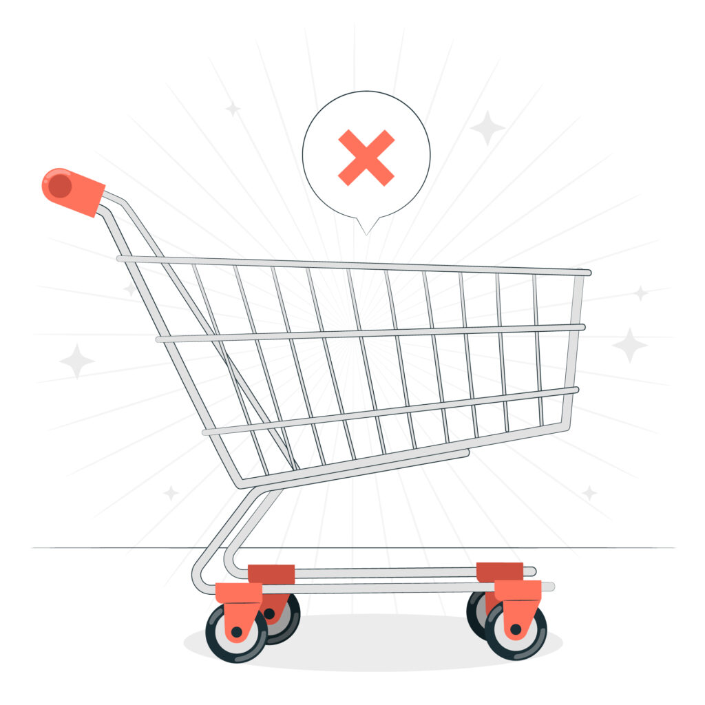
If you have bad user experience, you will suffer from increased cart abandonment. Customers- if you were lucky and they reached the purchase phase- will eventually get bored and frustrated and abondon their cart and leave your website!. As a matter of fact. It was found that The average cart abandonment rate hovers just under 70% because of the poor user experience, according to the Baymard Institute.
3. Higher bounce rate and lower SEO ranking!
When your users can’t find the needed information because of the messed-up design or navigation, they will leave your site as soon as possible. This, unfortunately, will cause a higher bounce rate and harm your SEO!.
Why your SEO?
Because Google launched the page experience update in 2020, which focuses on UX metrics including how rapidly a site loads and how quickly a user can start interacting with it, among other things. And usually the loading speed influence the bounce rate, as it was found that the bounce rate of a page increases by 123% when load time is longer than 1 second according to Google survey report.
4. Say goodbye to your brand trust!
If you are thinking that cart abandonment is bad, then what about damaging your brand trust?!
Poor UX can look suspicious!. Consumers usually use the look of the website and its experience to make their own perception about the brand and see whether they can trust it or not. However, when your website has a bad UX, this will lead the customers to lose their trust in your business. It was found that Judgments on website credibility are 75% based on a website’s overall aesthetics.
5. Increases customer acquisition rate:
According to PWC,1 in 3 customers will leave after a single poor experience with a brand. This means you will lose customers that you worked hard to acquire. Having a bad UX not only impacts your ability to retain your customers but also your ability to acquire new ones.
You will need to double your effort to maintain your baseline sales goal by increasing your marketing and ad spen, which will go in vain at the end of the day because of your bad UX. So you will stay in a closed loop trying to figure out a solution.
Now,having introduced some of the negative consequences of a bad UX. It’s about time to learn how to avoid all of that through some tips from Thamara.
Here are some of Thamara’s tips to fix and enhance your UX!
1. Optimize your Loading speed:
As previously mentioned, website loading speed has a great effect on your consumers’ satisfaction. According to Think with Google, it was found that 53% of the time, visitors to mobile sites leave a page that takes more than three seconds to load.
That is why you need to pay attention to your loading speed and see whether you have a problem with it or not. However the way you used to build your website, whether through website builders or website hosting sites or even you constructed your own website through your development team, you need to always analyze your loading speed and make sure it is loading quickly, so that you can avoid losing your customers and making them jump to another website. A free tool to analyze your page speed is through Google’s free platform.
Tip: If you are an e-commerce builder who is looking for website builders, you can check out these articles: Explore the top 7 E-commerce builders in MENA region and 9 best e-commerce builders to elevate your business.
2. White space is your friend!
Try to embrace the white space in your website for a more concise, clean and organized look that will satisfy the consumers and help them have a better experience with your website. As a matter of Fact, adding white space to your website is one of the most effective design strategies you can use. It not only makes your content more readable but also enables you to direct visitors’ attention to the most crucial buttons.
The use of white space can boost your readers’ attention by roughly 20%. Also, this is among the simplest techniques you can use to give your website a modern, fresh and open appearance. Always try to divide your content if you have a large block of content grouped together, because this will make it easier for customers to grasp the needed and important information. Remember that it’s crucial to strike a balance between the amount of white space you use and the information you want to draw attention to.
3. Include Call to Actions wisely!
Enticing your customers to engage with you is so important for your business. And call to action buttons can easily achieve that, they help users navigate through your website and help you convert your visitors. However, you need to use it smartly!. Don’t overwhelm your customers with so many call-to-action buttons, this will annoy and distract them. Also, you need to think about the design and placement of your buttons. Always use colored buttons with action-oriented phrases such as: Get started, or Sign up to know more, etc.
Choosing the right words to connect your customers emotionally and choosing the right color with the right psychological effect will trigger the required and suitable emotions needed to take the desired action.
4. Make your website mobile-friendly:
Because 90% of smartphone users say they’re more likely to keep shopping if they’re having a great user experience.You need to pay extra attention to your website’s user experience on mobiles. This will be a deal breaker for your business!
You need to optimize the website content and information to be mobile friendly, make sure to put the call to action buttons near the center of the screen to be easily pressed by users’ thumbs. Also you need to make sure that your website layout is responsive to different and multiple screens.
5. Simple and Concise navigation:
You need to think of the flow of your website, imagine how customers might take each step, and design your flow and navigation based on that.
Ensure that you have easily understandable languages with clear and simple navigation options. Let us reveal a little secret! Too many options will distract your visitors.
Although you might think that appearing a little bit complex might impress your visitors, this is not true. You need to maintain your website’s simplicity while giving options to your customers to navigate through your website easily, however, too many buttons and options will confuse and frustrate your customers, and too few options will make the navigation journey take a longer time, clicks, and pages, which is not recommended as well. So you need to find the perfect balance that fits your business.
6. Analysis is the key!
In order to keep track of your UX performance, you need to always analyze it, constantly optimize it, and fix any problem or weak point that might appear.
You need to use tools and platforms that will help you track what customers do on your website and what they don’t. Tools such as Google Analytics heat maps and Crazy Egg will save you this hassle! This will help you gain a better understanding of your customers’ behavior on your website. Also, Performance marketing can help you with that! Collaborating with a performance marketing agency can help you constantly analyze your UX to better improve it and reach the ultimate results you want.
Bottom Line:
The main objective of having a great UX is making it easy and enjoyable for your customers to use your website or application. However, Bad UX can truly harm your business and marketing performance, that is why you need to take a good care of your UX and analyze it.
Hopefully, after reading this article, you are now familiar with the poor UX symptoms and how to identify your UX performance, the negative consequences of having a bad user experience, and the perfect way to nail the UX dilemma.
